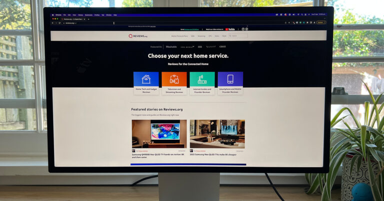
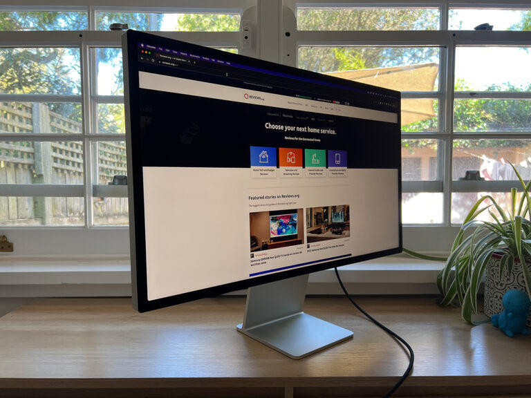
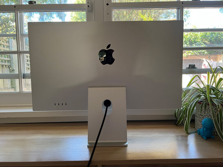
Optus Mobile Review ALDI Mobile Review Amaysim Mobile Review Belong Mobile Review Circles.Life Review Vodafone Mobile Review Woolworths Mobile Review Felix Mobile Review Best iPhone Plans Best Family Mobile Plans Best Budget Smartphones Best Prepaid Plans Best SIM-Only Plans Best Plans For Kids And Teens Best Cheap Mobile Plans Telstra vs Optus Mobile Optus NBN Review Belong NBN Review Vodafone NBN Review Superloop NBN Review Aussie BB NBN Review iiNet NBN Review MyRepublic NBN Review TPG NBN Review Best NBN Satellite Plans Best NBN Alternatives Best NBN Providers Best Home Wireless Plans What is a Good NBN Speed? Test NBN Speed How to speed up your internet Optus vs Telstra Broadband ExpressVPN Review CyberGhost VPN Review NordVPN Review PureVPN Review Norton Secure VPN Review IPVanish VPN Review Windscribe VPN Review Hotspot Shield VPN Review Best cheap VPN services Best VPN for streaming Best VPNs for gaming What is a VPN? VPNs for ad-blocking It reminds me of the somewhat not safe for work Rick & Morty skit where Morty briefly experiences “true level”, or perfect flatness. After standing on a TRULY flat surface, Morty is unable to look at the world the same way he used to. Everything is crooked. EVERYTHING. While my perception of level hasn’t been shattered, I can’t look at other monitors the same way. The pixels are just so …visible. This formula is consistent across product categories, and so when Apple released the first Retina 27-inch iMac, it introduced a 5,120 x 2,880 panel (5K), up from 2,560 x 1,440. This made it easy for developers to support high density displays, as they simply needed to double the size of their apps’ assets. Instead of having more usable screen real estate, you’re instead getting a sharper, clearer image. So when you plug the Studio Display into a Mac, you’re using an effective resolution of 2,560 x 1,440, even if the panel is 5K. The catch is there isn’t an in-between. Apps can only run at 100% or 200%. The Studio Display can run at other resolutions if you need extra - 3,200 x 1,800 for example - but then you’re not getting a pixel perfect image. Instead, macOS will render the operating system at 5K and then scale it down to 3K. This can impact performance, and since it’s not a neat ratio, you’ll lose detail. For some, this won’t matter - select Mac laptops even ship with scaled displays out of the box. But for others, losing detail just isn’t acceptable. Graphic designers, for example. This is why a 4K monitor isn’t necessarily the best pairing for a Mac. You’ve got the choice of running at an effective resolution of 1080p or a native resolution of 4K. For a 27-inch monitor, 1080p is going to look massive, while 4K will be too small to be usable. As such, a scaled resolution is the best solution, but that’s when you lose detail. You end up with one of those ratios that just isn’t neat. In short, a 5K screen is going to be that little bit nicer, and for some professions, that little bit nicer is going to make all the difference. 5K monitors aren’t exactly common, however. LG is one of the few manufacturers to sell one, and even that will set you back almost $2,000. The Studio Display marks the first time Apple has shipped a 5K screen outside of an iMac. And look, working on the Studio Display is a joy. You have enough screen real estate that I haven’t missed using my standard dual screen setup. The resolution means everything is crisp, clear, and easy on the eyes. There’s no colour distortion off axis. It also supports True Tone, which tweaks the screen to your display based on your environmental lighting. Despite this, the panel tech itself is somewhat dated. The Studio Display uses a traditional LCD panel, rather than opting for newer options like MiniLED or OLED. This means the Studio Display can’t accurately display blacks - they’re more of a dark grey, which becomes especially clear in a dark room or next to the bezels. There’s not even any local dimming. You also miss out on any sort of HDR support, and the panel is limited to a 60Hz refresh rate. Many will see the 60Hz refresh rate as an odd choice when plenty of Apple’s iPhones, iPads, and MacBooks now all have 120Hz displays - branded as ProMotion. The omission is however more of a technical limitation, rather than Apple skimping on features. Thunderbolt 3 - the display standard used to connect the Studio Display to your Mac - simply doesn’t have the bandwidth for 120Hz at a resolution as large as 5K. Of course, a technical explanation doesn’t just wave the problem away, and won’t do much to satisfy those who’d prefer a high refresh rate over the extra resolution. The Studio Display speakers genuinely sound great, far better than what you’d expect from a monitor. The bass response is a bit subdued (but still very much present, and surprising for the form factor), and it’s not going to replace the need for reference headphones or speakers when doing professional audience work, but the Studio Display makes for a great day-to-day speaker. By contrast, the integrated webcam is uncharacteristically awful. Video is blurry and grainy even in a room with good lighting, and performance only gets worse in the dark. Apple has said it will be making improvements to the webcam via a future software update, but it has yet to provide a timeline on this. The Studio Display webcam also supports Centre Stage, software that automatically adjusts your shot for optimal framing. On one hand, this is a neat trick. With Centre Stage disabled, I’ve found I need to tilt the Studio Display down to not have far too much headroom in my video calls. Like, tilt it WAY down, to the point where using the screen is awkward. On the other hand, Centre Stage can be a bit too smart for its own good. My partner’s desk is behind mine, in the opposite corner of our office. When I’m on a video call, Centre Stage will constantly try and adjust the shot to fit my partner into the frame, even though she’s not looking at the camera. I’d love to see Apple offer a middle ground. Something in between having Centre Stage just on or off. Maybe an option to just lock on to one person, and ignore everything else happening in the background. It’s worth noting the Studio Display will work with a Windows machine, including the webcam and speakers. You’ll miss out on software-driven functionality, however, such as Centre Stage, Hey Siri, and Spatial Audio. The Studio Display is clearly built for Mac owners, but it will work in a pinch if you’re a Mac user who also uses Windows from time to time. The first is the stand. If you buy the default $2,499 configuration, you can only adjust the tilt on the Studio Display. If you want a height adjustable stand, you’ll need to spend an extra $600. That’s a massive premium for a slightly fancier hinge. The stands themselves aren’t user removable, and if you want a VESA mount for use with a monitor arm, you have to forgo a stand entirely. Given the vast majority of monitors support VESA out of the box, it’s a questionable decision from Apple that makes the Studio Display a little less versatile. Similarly, the Studio Display’s power cable isn’t designed to be removable (you can yank it out with enough force). This is much less egregious than the stand situation, but still worth noting. If the cable gets damaged, you’ll likely need to take your Studio Display in for repair. You can’t just swap it out for a fresh one as with pretty much every other monitor. When configuring your Studio Display, you also have the choice of picking between standard glass or nano-texture glass for $500 extra. Nano-texture glass is etched to further minimise glare, especially in bright work environments. I used the nano-texture model for the sake of this review, and while I didn’t have a standard Studio Display to compare to, the nano-texture option lived up to the promise. One last thing to be aware of is the Thunderbolt cable included in the box is only 1m long. That will be long enough for many users, but in some cases, it might not suffice. If you’re looking for a longer cable, the pricing is quite steep. A 1.8m cable will set you back $199, while 3m is an even pricier $249. Ouch. This doesn’t stop the screen from Studio Display from being a lovely monitor, but it makes the $2,499 price harder to reconcile. It’s not a best of the best monitor, which for money, it should be. The Studio Display is only right for you if you truly want a 5K screen, and there are good reasons for that. Hell, I’ve fallen for the ultra high resolution siren song. You just need to understand the accompanying compromises, such as the lack of HDR support, the stock standard 60Hz refresh rate, and the inability to display anything close to “true black”. But despite these omissions and the egregious stand situation, I keep coming back to how much I enjoy working on a 5K screen. Everything is just so crisp. In the same way Rick had to wipe Morty’s experience of True Level, perhaps a teeny tiny lobotomy wouldn’t be so bad. I can’t do something dumb like buy a Studio Display or two if I can’t remember how damn nice 5K is while slaving away at a 1080p screen.
